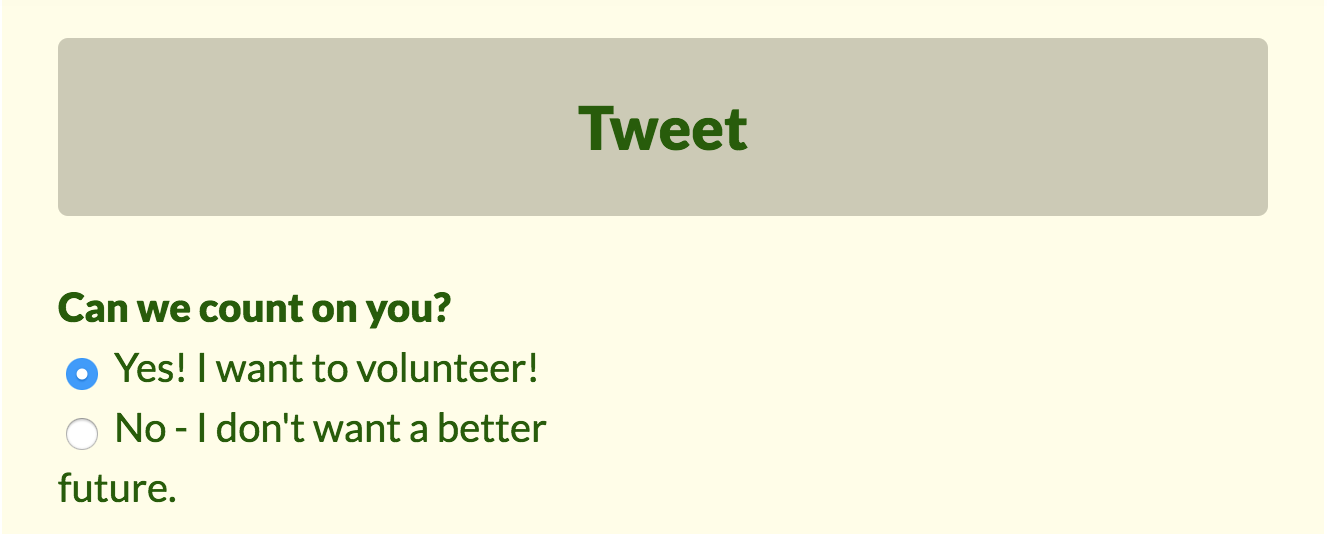
Adding a Select Options Component to your campaign tool is the gateway to creating a customizable set of options that supporters can click to provide additional information or to select opportunities for greater involvement in your campaign:
Here's how to add a Select Options Component to your campaign tool:
Step 1: Begin by following the steps to Create a New Component for an individual campaign tool or template.
When selecting a new component Type, choose Select Options. Name your new component according to how you want your options to be labeled on the live tool. For example, the component name might be “Do you want to volunteer?” This text will then appear to supporters above the buttons or checkbox you're setting up.
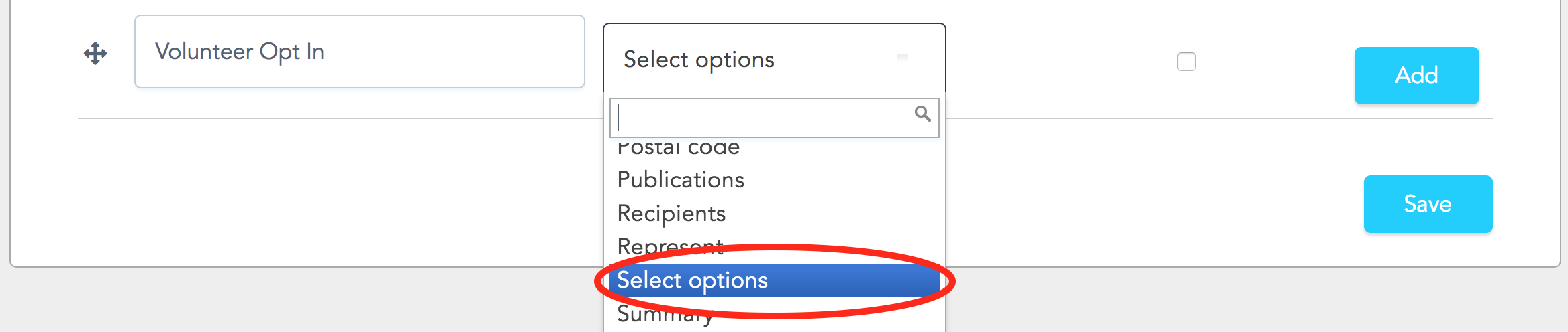
Step 2: Click Add, and you’ll be taken to the Edit Component page. The customizable settings unique to this component are all available in the section labeled Options.
Notice that along the left-hand side of the section, you can use handles to drag and drop your list items into any order you want. Along the right-hand side of the section, you can add or delete the number of options you present to supporters: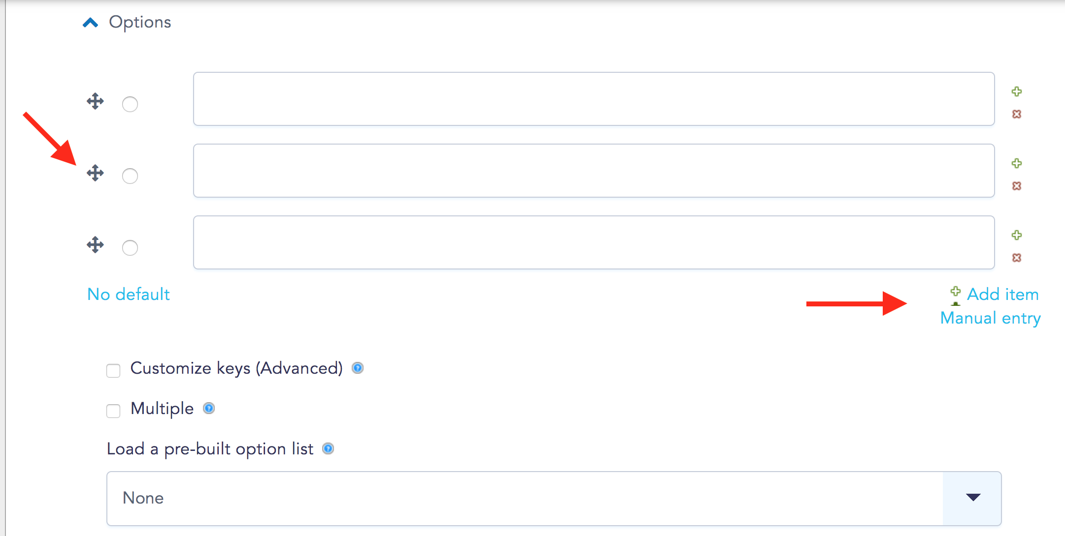
Using these settings, you can choose to create:
Radio Buttons
This setting, which uses round buttons, allows supporters to select one option. The text you enter into the fields here will appear on your form next to the buttons:
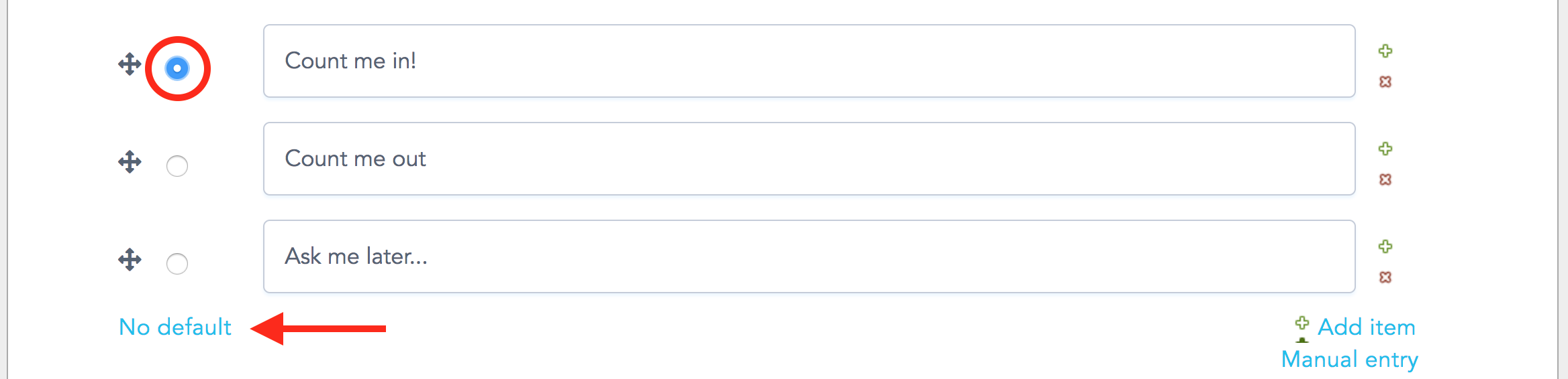
Use the No default button to select whether or not you would like the tool to display a pre-checked button.
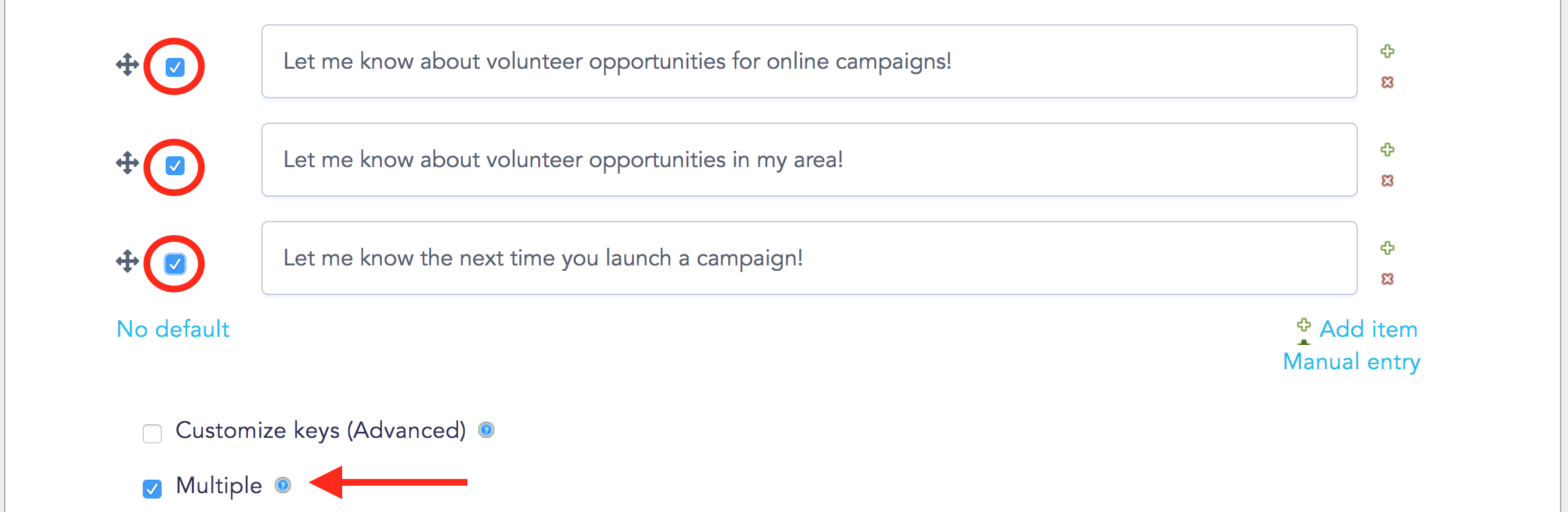
Checkboxes
Selecting the Multiple option will turn the radio buttons into square checkboxes. With this setting, supporters will be able to select one or more options:
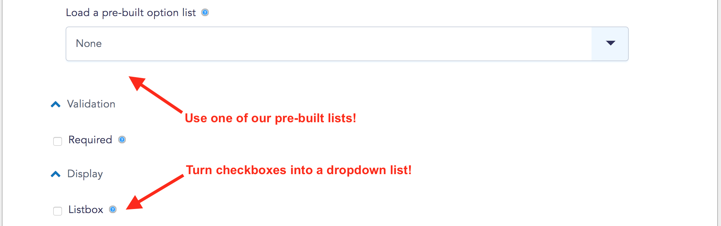
Dropdown Menu
This is also the section where you can setup the Select Options component to create a dropdown list:
Find a detailed walkthrough here.
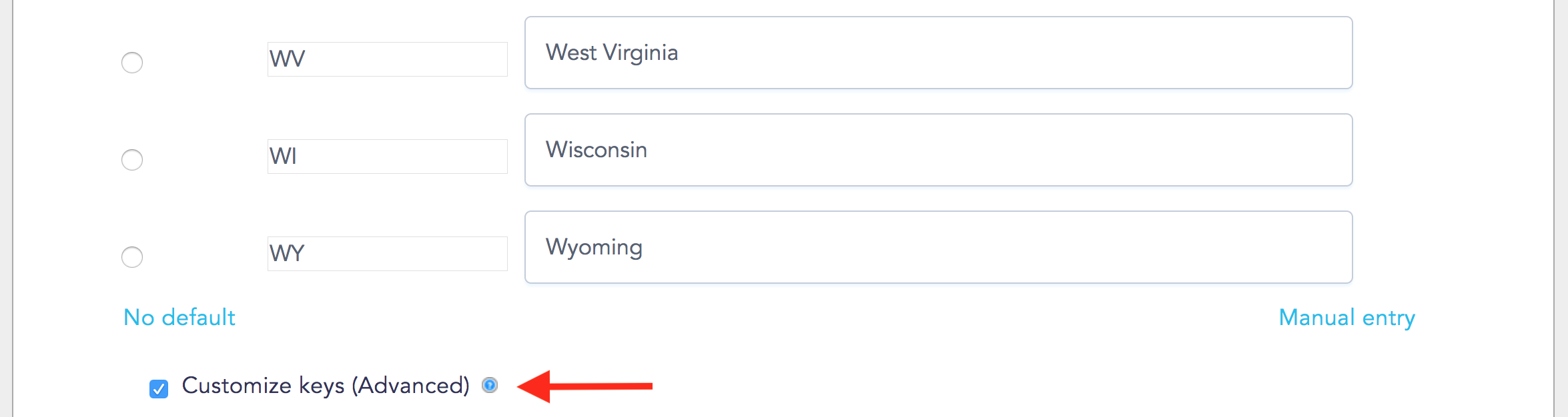
Customize Keys
Selecting this option will allow you to save one value internally while showing a different option to supporters filling out your tool form. This is useful for setting custom values that conform to defined CRM data fields:
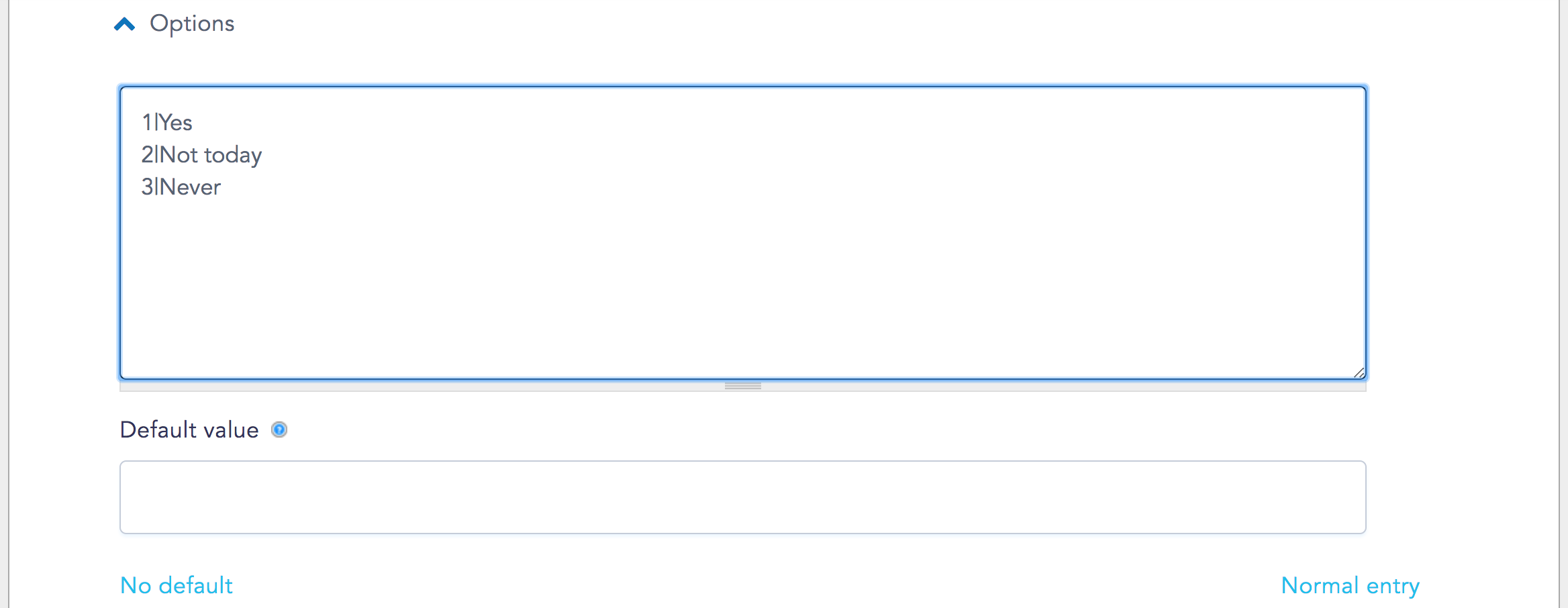
You can also set up default values in Manual entry mode by using pipes to separate outputs and inputs:
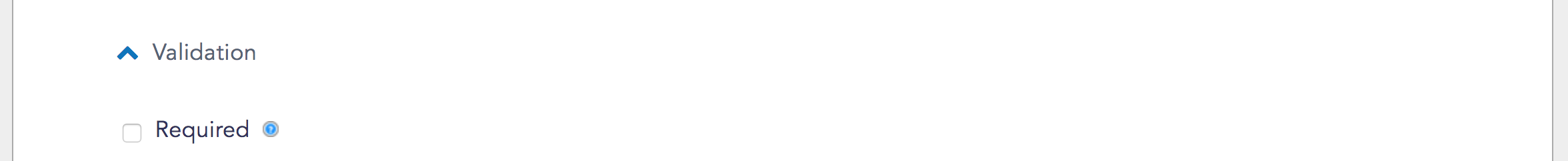
Step 3: Under the Validation section of the page, select whether or not you want supporter responses to be Required. If you select required, supporters will not be able to complete the form without providing a response:
Step 4: Click Save Component at the bottom of the page, and head over to the View screen to see your newly created buttons or boxes. You can return to this Edit Component page to continue to work on your new component!
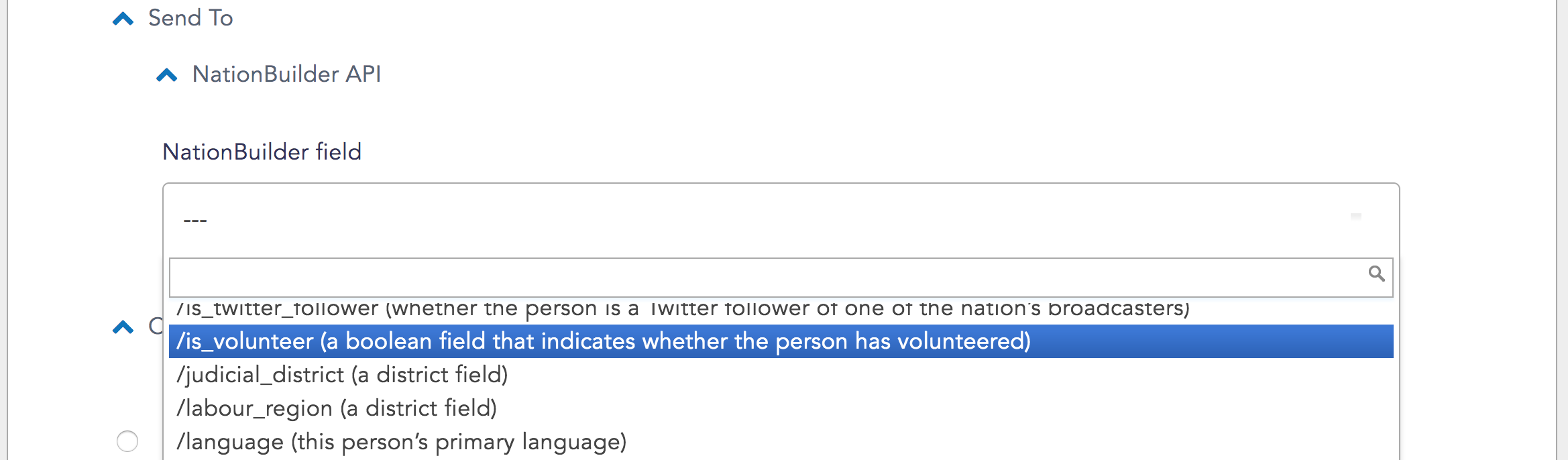
Step 5 (Optional): If you’re planning on sending data to a CRM, scroll to the Send to section of the Edit Component page. Select the CRM field you want to associate with the data produced by your new component. The field will depend on the CRM you’re using and the data you’re collecting with this component:
Learn more about tool components.
Learn how to add a dropdown menu to your campaign tool.