This feature is available on the Campaign Builder, Organization, and Network plans.
When you're working on editing or creating a new component, you'll be taken to the Edit Component page. You can access the Edit Component page by clicking the blue Edit link to the right of a component.
Each component of a campaign tool has slightly different settings, but some of the basic editable characteristics of all components include:
Tool Naming
Label: this is just a simple descriptive name associated with this component. You might want to rename it if, for example, you're working with a CRM, and you want the component field to have the same label it has in your CRM.
Field Key: this is the name attributed to the form element. It has to be machine readable (only alphanumeric characters and underscores). This value has no effect on the way that data is saved, but may help with custom form processing.
(Default) Value: A component's value is the information that it contains. For components that you've customized under Content, like Introductory Message and Key Points, the value is the text you've entered. Other components, like those text fields to be filled out by supporters, should be blank, or might include custom tokens that enter a value automatically, like the date or the names of targeted decision-makers.
Description: you can choose to enter a brief description of the component to help your supporters fill it out with the correct information.
The other settings for components vary based on the component type. Some of the options you'll come across include:
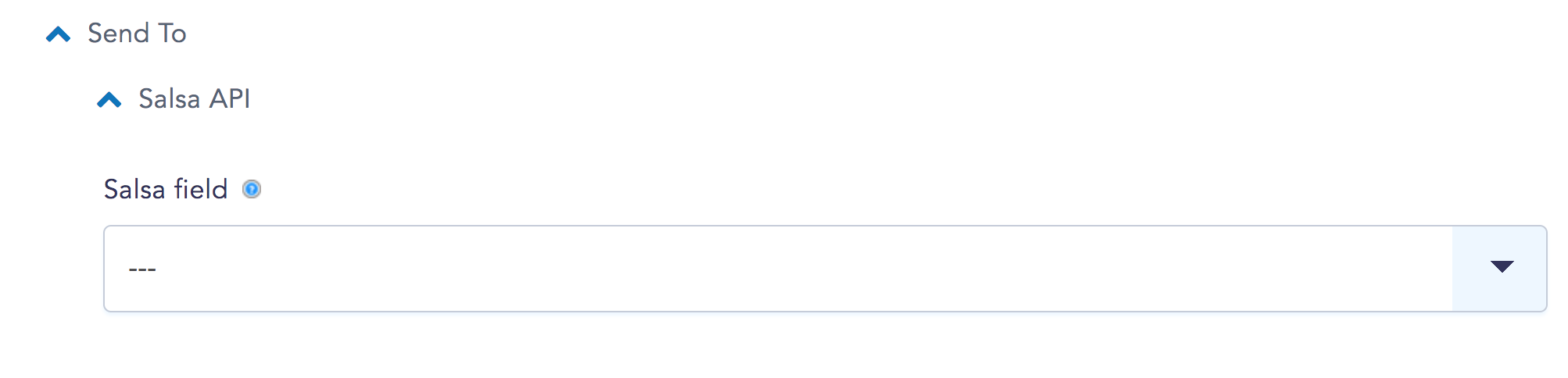
Send To
You'll only see options under this heading if you have your campaign tool synced to a CRM. Select or manually enter the name of the form field in your CRM that you would like to sync with the associated New/Mode component:
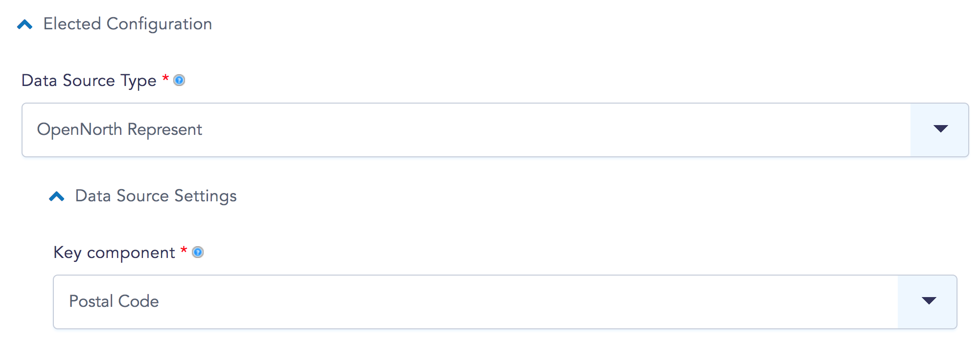
Elected Configuration
These options will only appear for the Elected type tool component, which figures out how to target decision-makers. You can learn more about configuring this component here.
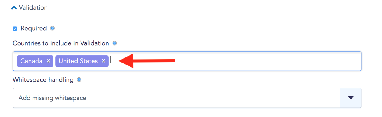
Validation
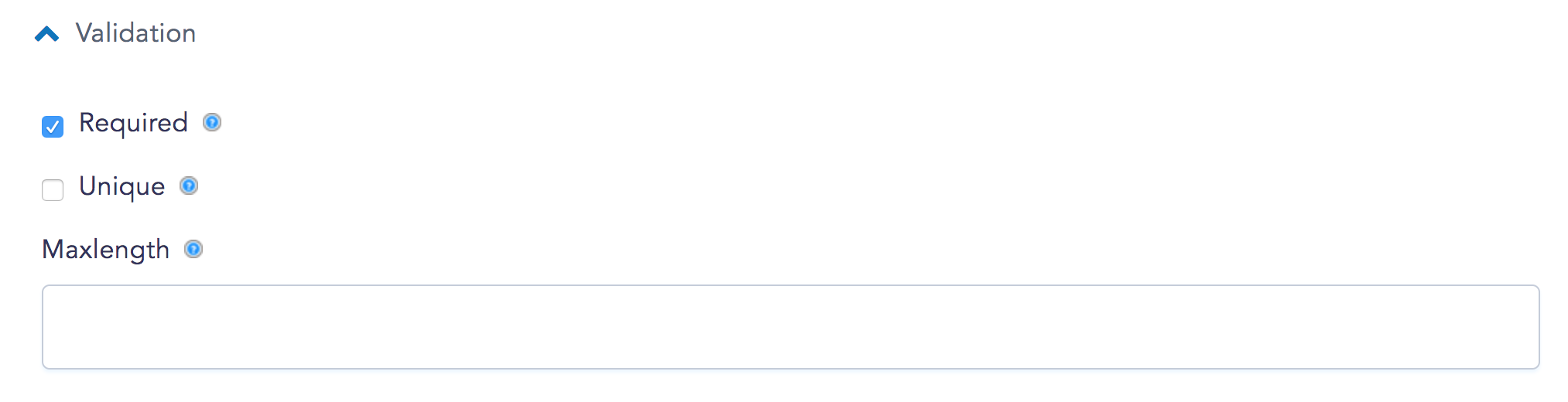
You'll only see this option for components that have to be filled out by supporters. The settings here determine the actions that need to be taken to complete a particular field. For example, text fields filled by supporters are Required by default, but you can change validation settings to suit your campaign:
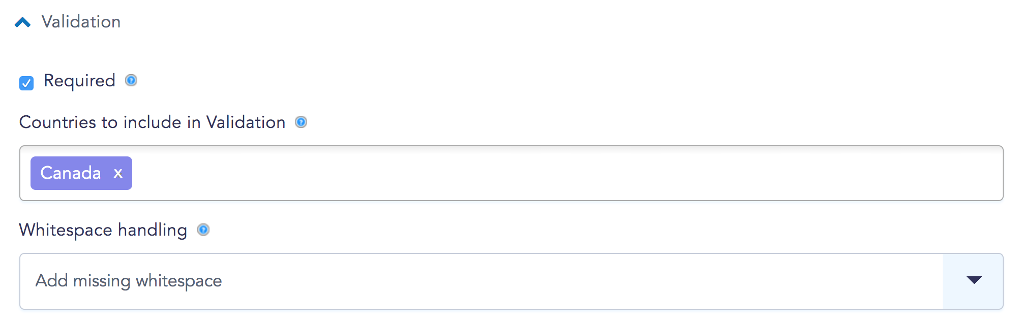
For postal/zip codes, validation is determined by the country being targeted and whether or not the field will allow for whitespace:
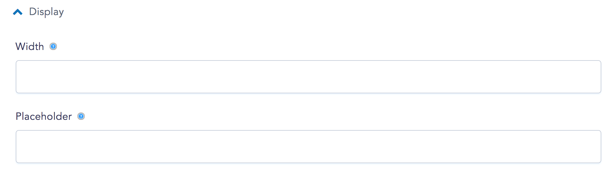
Display
Every component has its own unique Display settings that allow you to customize its appearance and placement, including the size of the textfield, what information it displays to your supporters, whether it is hidden or visible to supporters, and where it should display on the tool form:
Don't forgot to hit that friendly blue Save Component button at the bottom of the page after you've made changes!